|
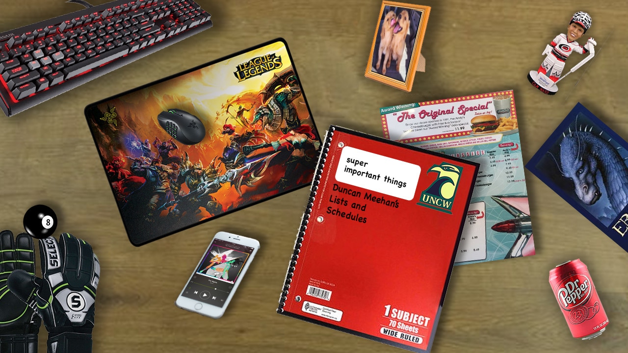
This project displays all of the things that are important to me. Everything from hobbies to pets to school. I used drop shadows and perspective warps to help give it a more realistic effect as if you were looking down at an actual desk.
|
|
This project that I have done uses my favorite logo from my logo project that you will find below. I have made six variations of this particular logo and included the colors along with a pattern of what the logo could look like. It is a logo from a made up company with inspiration from other logos I researched. |
|
|
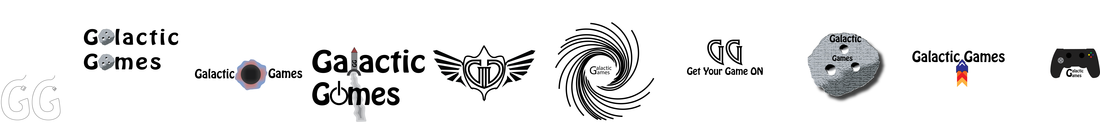
These logos are ten of twenty that I created for a fake company. I used their background to design logos based around what the purpose and target audience of the company is. The purpose of the company is to create games for children 8-18 years old. Therefore, the designs are fairly simplistic while at the same time, appealing to older kids.
|
|
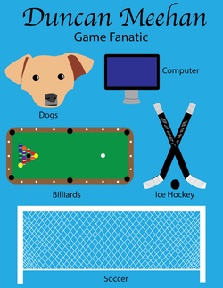
This Is one of my favorite projects this semester due to the freedom we had with it. The assignment was to make our own page made up things that we find important in our life. I knew immediately what 5 images I wanted to make and the only issues I ran into were the sizing issues. I had to make all 5 pictures fit on the same page will still making them roughly the same size which can prove to be a challenge when some of the objects should be much larger. Overall it is still one of my favorite projects.
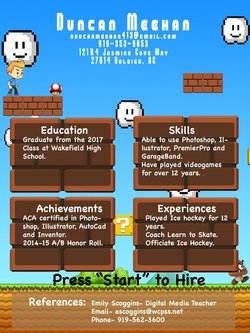
This is the first project I did for the semester and it still one of my best pictures. I wanted to make a resumé that was different and unique as well as related to the field in which I would like to work. The field is Game Art design and because of this I wanted to use images and text that would be recognizable to anyone. I used sprites from the Super Mario series and text that looks as close to the Super Mario text as I could get. I didn't have too many issues with this project besides trying to balance the empty space in the picture but still having enough in the picture to make it exciting.
